Companion. Stay safe.
The impact
Redesigned the Companion mobile app, untangling three overlapping usability failures — a hidden gesture, an undiscoverable feature, and a broken trust signal — through prototyping, user surveys, and structured iteration across iOS and Android.
The problem
Companion lets users share their live location with family, friends, or campus safety while walking home at night. The product worked. Users weren't engaging with it.
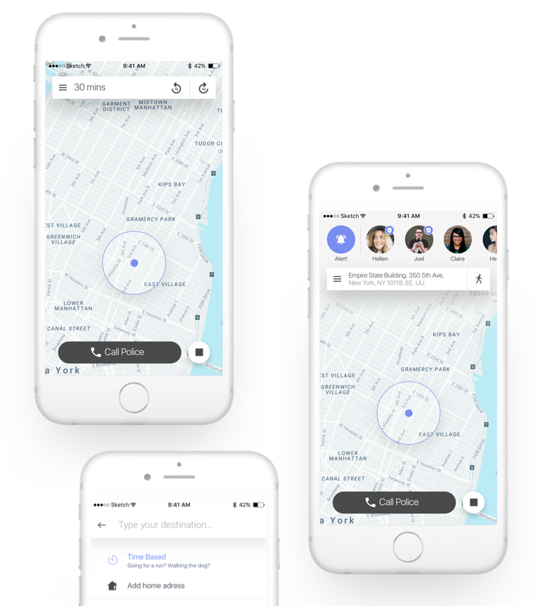
Three things were broken. Transportation mode selection required dragging the map — a gesture new users never found. Wander Mode, a timer-based trip option that was Companion's most differentiated feature, had near-zero uptake. And companions — the people watching over you — were represented by initials, which drained the experience of the one thing a safety app depends on: the feeling that someone specific is watching.
Jake Wayne and Lexie Ernst, co-CEOs, reached out to redesign the app. They needed a designer with experience in map-based products. I came in as the sole design lead, working directly with the founders.
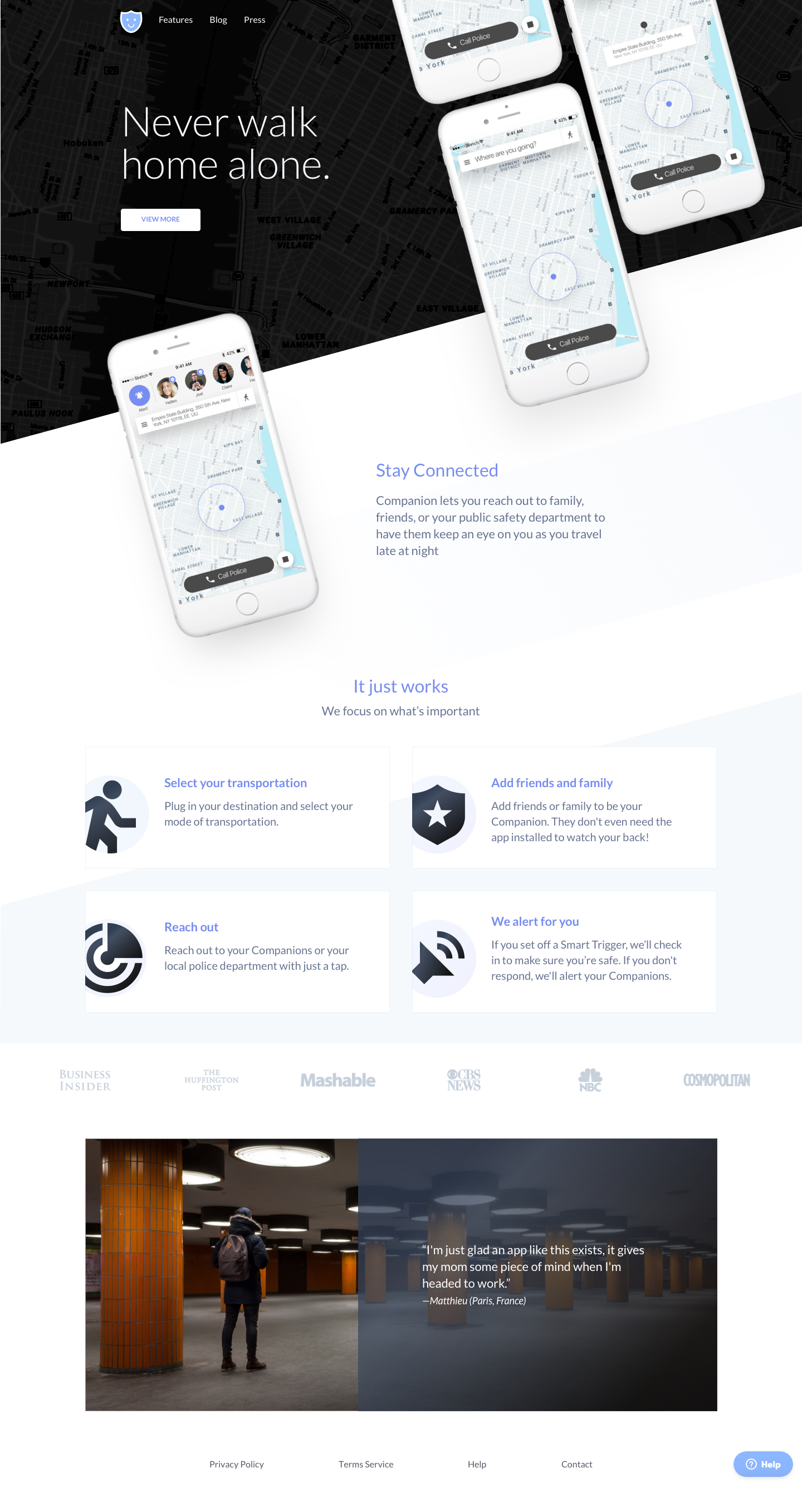
Landing page redesign used as an alignment test before the engagement began. Approved, then used to anchor the visual direction for the app.
My role
Freelance design lead, sole designer. I owned the full engagement — research, flows, visual design, and handoff across iOS and Android — working with the founders in weekly async sprints across timezones.
Before committing to the full project, I proposed a landing page redesign as a calibration check. That proposal defined the visual direction and confirmed we were aligned on approach.
The constraint
I had no direct access to end users for interviews. Research was built from three sources: hands-on analysis of the existing app, structured surveys with task-based questions, and detailed discussions with the founders.
The survey gave both quantitative signal (task success rates, frequency of feature use) and qualitative signal (where users felt uncertain or confused). The clearest finding: users were getting stuck at transportation mode selection, and the confusion wasn't a preference issue — it was an interaction pattern they'd never seen before.
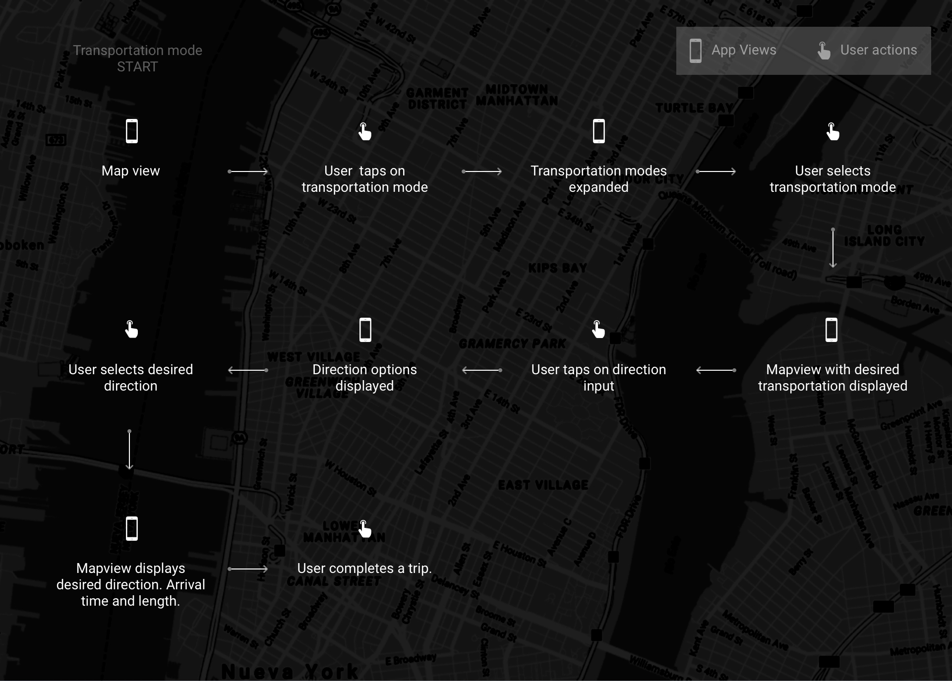
Sketched user flow for transportation selection, mapped before prototyping began.
Survey results. The transportation confusion signal showed up clearly across multiple question types.
Three directions, one winner
I developed three prototype directions to test the transportation selection problem.
Option A — Conversational. A stepped, guided flow. Lower decisions per screen, but added latency between intent and action. Users who knew what they wanted found it slower, not easier.
Option B — Expanded options. All modes surfaced at once. More scannable, but increased visual density at the start of a trip — the moment when users need the fewest decisions, not more.
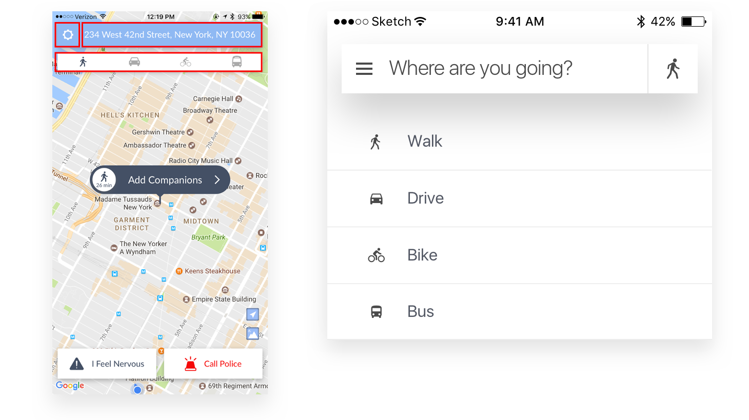
Option C — Single persistent icon, expanding on tap. One icon, always visible. Tap to reveal the full list of modes. Fewer affordances up front; more reliable than a hidden gesture.
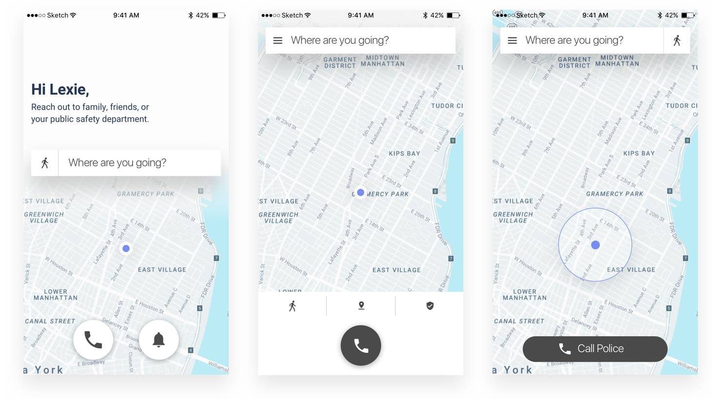
Options A, B, and C. C won in testing on both discoverability and speed of mode-switching mid-trip.
Option C won because the action is occasional, not constant. Users change transportation modes rarely — when they do, they want it fast and available. A persistent icon is always there without dominating the interface.
More critically: it solved the gesture problem. The original UI required dragging the map to reveal transportation modes. That interaction was undiscoverable for new users and inconsistent with standard iOS and Android patterns. Option C replaced the drag with a tap — a universal affordance that doesn't require instruction.
The list structure also made the design extensible. Adding a new mode in the original UI would have broken the layout. In the new pattern, it's one more list item.
Before: users drag the map to reveal transportation modes — an undiscoverable gesture. After: a persistent icon, always accessible, opens a mode list on tap.
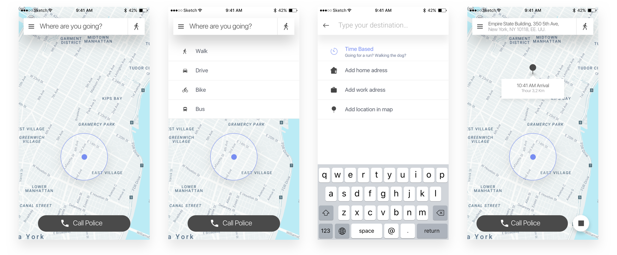
Refined transportation mode selection flow after testing Option C.
The word that unlocked a feature
Wander Mode had low engagement. The team assumed the problem was placement. It wasn't.
"Wander Mode" read as a description of user behavior — wandering — not a product feature. Users who weren't sure what it did assumed it wasn't for them. The feature was reachable; it just wasn't legible.
I tested alternative labels: Timer Mode, Time-based Mode, Exercise Mode. Each was more literal but introduced the wrong scope — "Exercise Mode" excluded casual walks; "Time-based" was technically accurate but cold. The solution was to stop naming the category and start making the function visible — a combination of a revised label, a descriptive icon, and visual differentiation in the row to signal this mode behaved differently than a standard destination trip.
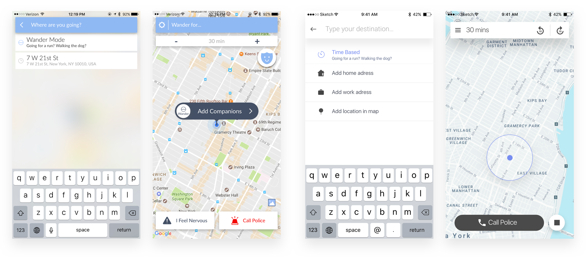
Before: icon-only row, indistinguishable from other modes. After: descriptive icon, differentiated visual treatment, legible copy.
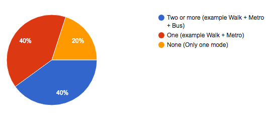
The survey had also revealed that the two most frequent destinations — home and work — accounted for the majority of trips by a wide margin. I added those as quick-select options to shorten the most common flow.
The detail that changed the feel
Companions were represented by initials, placed at the bottom of the screen. Functionally correct. Emotionally inert.
A safety app's primary job is to make you feel watched over by someone who knows you. Initials don't do that. They signal that someone might be paying attention — an abstraction, not a presence.
I changed companion representation to real photos using contact-style UI patterns familiar from messaging apps. The interaction became personal in the way a text from a friend is personal: it tells you immediately who's on the other end.
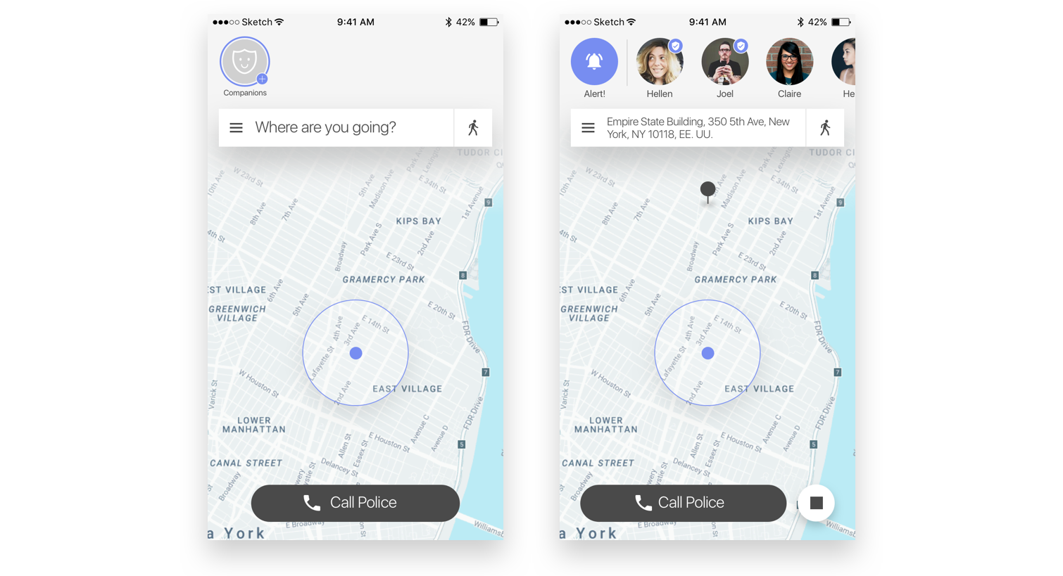
Final redesign. Companions surface as real people; transportation modes are always accessible; Wander Mode is legible.
Impact
The redesigned transportation flow showed improved task completion in user testing — users who had previously needed instruction found the mode selector without prompting. Wander Mode discoverability improved after the label and icon changes. The companion photo update was consistently flagged in feedback as increasing the feeling of safety.
No post-launch metrics — the engagement ended before the redesign shipped. Jake and Lexie were building their NYC team and chose to pause design to focus on stability. Weeks after the engagement closed, they were selected on Planet of the Apps.

Jake & Lexie pitching Companion on Planet of the Apps.
Key learnings
Progressive disclosure matches real usage patterns. Option C wasn't minimal for aesthetic reasons. Transportation mode changes are infrequent. Hiding options behind a single tap is the right call when the action doesn't happen often enough to justify permanent screen real estate.
Naming is a design problem. Wander Mode's low engagement wasn't a placement or visibility issue. The label set the wrong expectation. A word change, backed by a visual signal, moved the needle more than repositioning the feature would have.
Trust is a material. Changing companions from initials to photos wasn't cosmetic. In a safety context, the feeling that a real person is watching is the product. The design decision directly affected the core value proposition.
Async, cross-timezone work requires explicit documentation. Every design decision was written up and shared before the next sprint. Not optional — it was the only way decisions moved forward without live context to lean on.