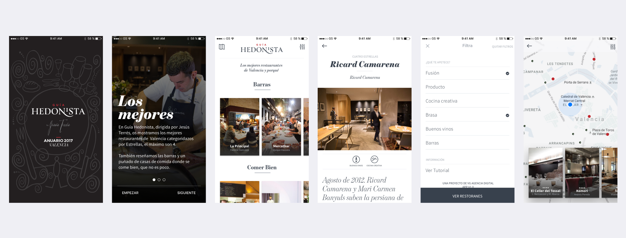
Guía Hedonista. A curated selection of restaurants that brings the best local gastronomy.
The impact
Designed La Guía Hedonista's iOS and Android app from scratch — translating a curated gastronomy publication into a mobile experience that serves three distinct usage modes: planning, discovery, and daily practical. Shipped on both platforms.
The problem
La Guía Hedonista is a digital magazine covering the gastronomy of the Valencian Community — restaurants, chefs, local produce, criticism. In 2018, the team decided to move to mobile.
The challenge wasn't porting content. Magazine content is deep, expert-curated, and long-form. Mobile usage is short, contextual, and location-aware. Those two things don't naturally fit. The app needed to work for a reader who spends twenty minutes with a review before booking, and for someone standing on a street corner who needs a good restaurant in the next ten minutes.
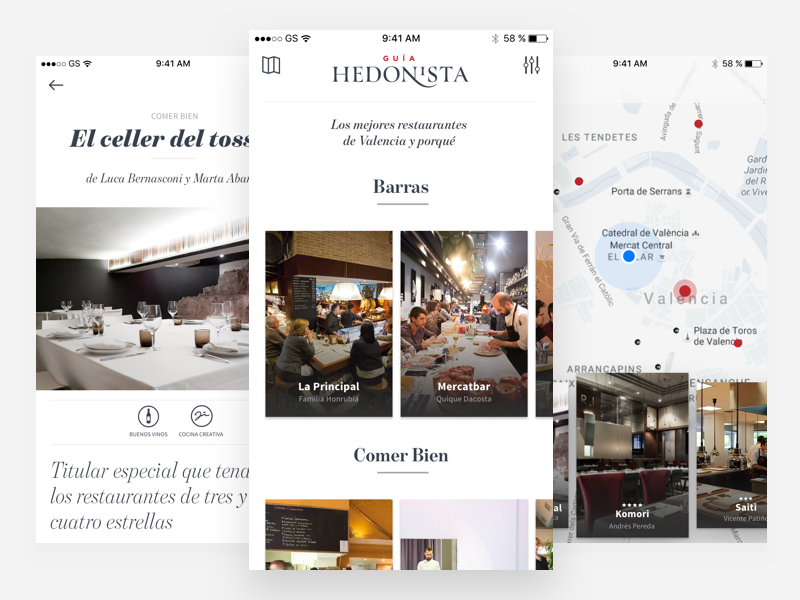
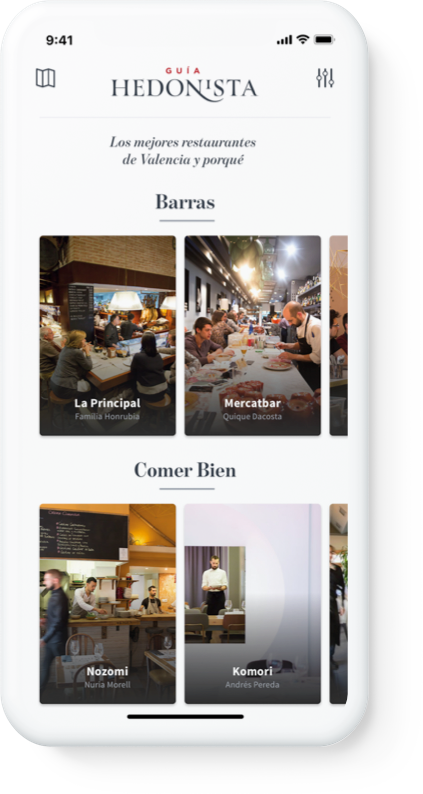
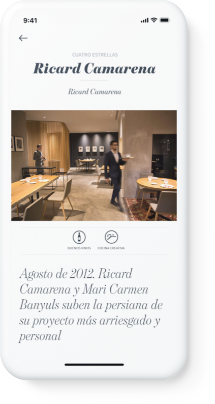
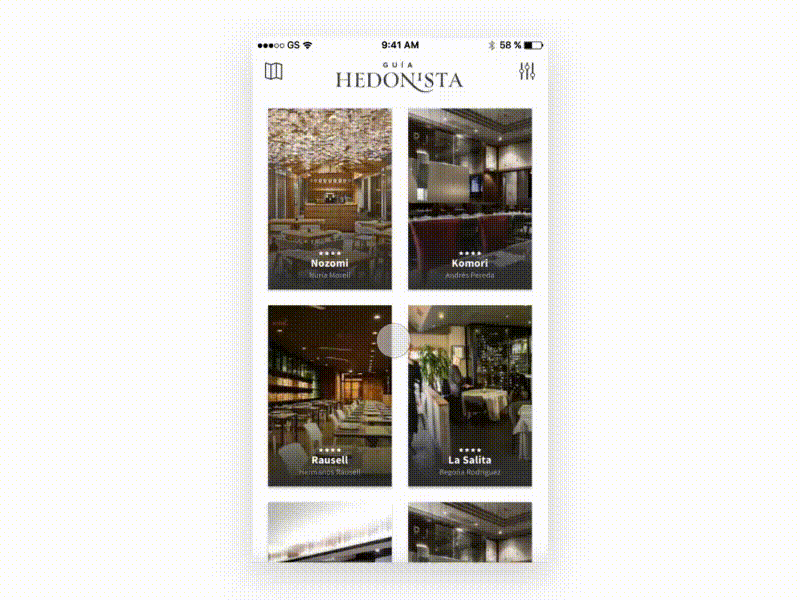
Home, Map and Detail views of the iOS app.
My role
Product design lead, sole designer. End-to-end ownership across iOS and Android — user research, information architecture, wireframes, prototyping, visual design, design system, and developer handoff.
I worked directly with the head of the publication and art director, the VG digital agency team, and key stakeholders. The editorial voice was a given; the product structure had to be designed from zero.
Three users, three modes
The research phase surfaced three user types with genuinely different needs, not variations on the same task.
The planner. Books in advance. Reads reviews carefully before committing. Wants expert curation and trusts specific critics. Needs depth: full review, chef context, reservation contact.
The foodie discoverer. Doesn't plan. Uses the app to explore and find things they didn't know existed. Expert filtering matters — they want quality curation, not a directory. Needs breadth and a discovery mechanism.
The daily urbanite. Eats away from home regularly. Needs something reliable, nearby, today. No time for reviews — needs proximity, category, and quick-scan trust signals.
These three modes defined the core architecture tension: the same content needed to be accessible at different depths, at different speeds. A heavy editorial interface would serve the planner but lose the urbanite. A map-first interface would serve discovery but bury the content that made the publication worth using.
Information architecture and early prototyping
Starting from the user types, I mapped the jobs each mode required:
- Discovering a restaurant through expert review → curated feed, clear reading hierarchy
- Filtering by cuisine, neighborhood, or price → filters that don't disrupt the browsing flow
- Finding something nearby right now → map with proximity logic
- Contacting a restaurant or making a reservation → restaurant detail with direct actions
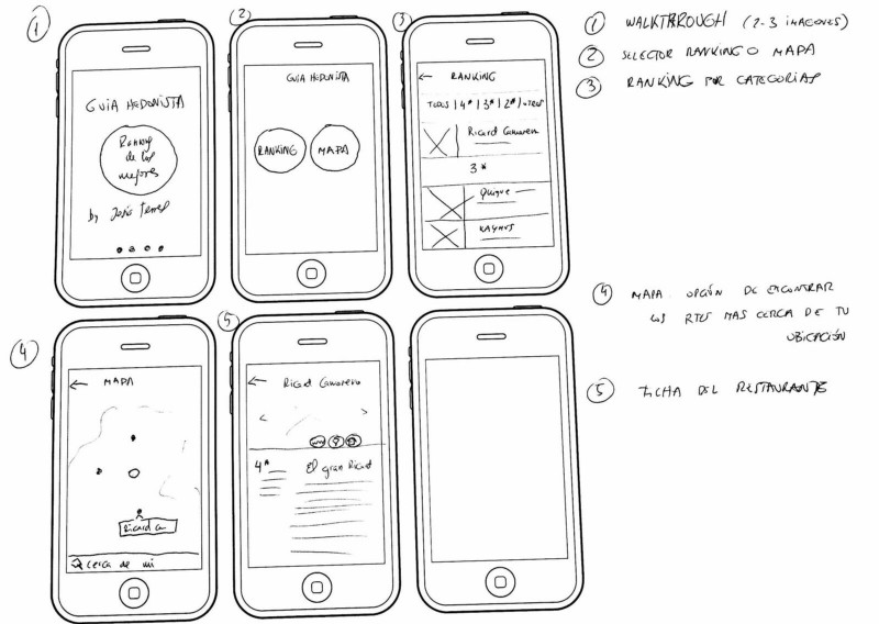
First wireframe from the publication team, used as a starting point.
I took that initial wireframe and developed higher-fidelity flows — fast enough to validate structure and interaction without committing to visual design.
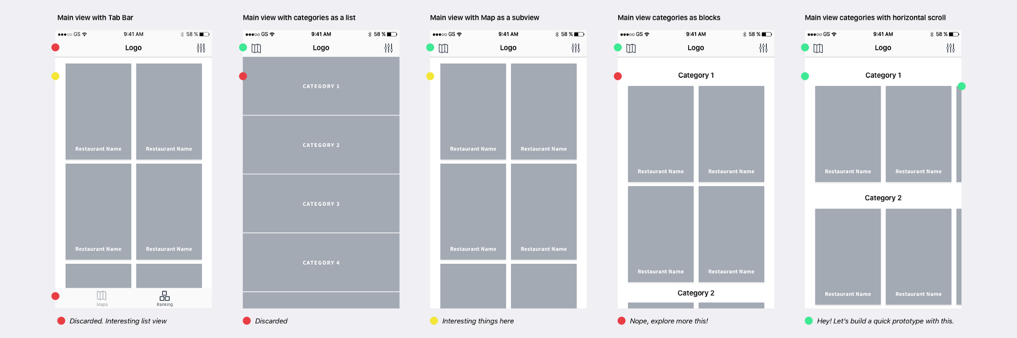
Annotated wireframes used to validate flow and navigation structure with the team.
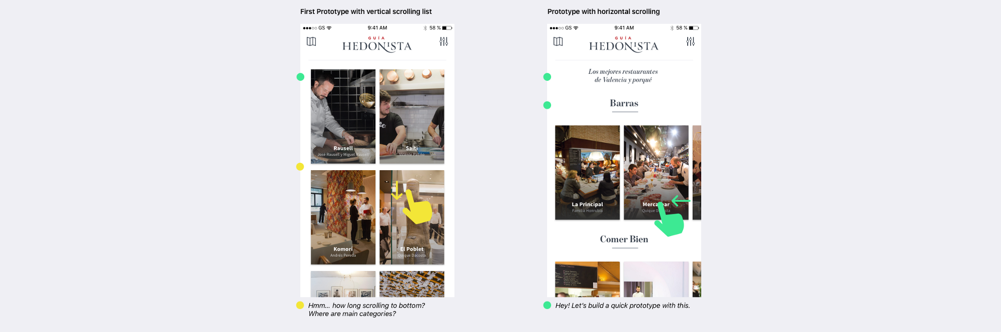
Early prototypes testing interaction and content density in the main view.
If a picture is worth 1000 words, a prototype is worth 1000 meetings.
— Tom & David Kelley
The decision that changed filter behavior
Testing the filter view surfaced a problem I hadn't anticipated.
When users tapped the back button after setting filters, a significant portion assumed they were returning without applying their selections — not navigating back with filters active. The interaction pattern mapped onto two conflicting mental models: "back" as "undo" (cancel and return) versus "back" as "confirm and return" (save and navigate). Neither was clearly communicated.
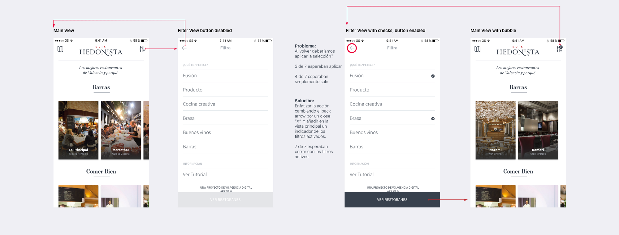
Testing revealed the back button created ambiguity — was it cancelling filters or applying them?
One of the basic needs we all share is that everyone needs to understand.
— Essential design principles WWDC 2017
The fix was to stop using "back" entirely for this context.
Replacing "←" with "×" signaled closure, not navigation reversal. A close action says "dismiss this overlay." A back action says "return to previous state." They feel different and users respond to them differently. I added a filter reset option and an active-filter indicator in the main view so users could always tell whether filters were in effect.
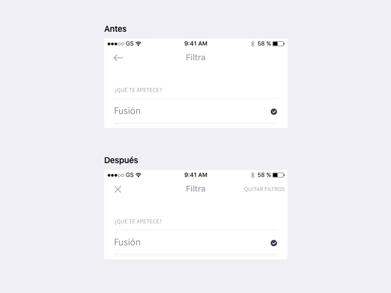
Before: back arrow created ambiguity about whether filters applied. After: close icon, reset option, and active-filter indicator.
One icon change eliminated a comprehension failure that was affecting how often users engaged with filters at all.
Map as discovery surface
The map view had to serve the discovery and proximity use cases simultaneously. Several proposals didn't work: a standard pin map required too much interaction to get to useful content, and a full-screen list without spatial context missed the "what's around me" need entirely.
The solution was a floating card layer above the map. Your position centers the view; nearby restaurant markers populate around it. Tapping a marker focuses the card layer on that restaurant. The map stays visible and spatial context stays intact — you're never navigating away from it.
Map interaction: location center, card layer focused on selected restaurant.
This pattern matched how people actually use maps for discovery — they scan spatially first, then dive into content. It also matched development time constraints better than a more complex split-view alternative.
Design is never done.
— Luke Wroblewski
Design system
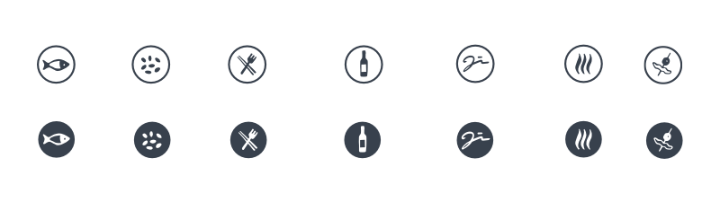
Four colors. Two typefaces. An 8pt spacing system. Atoms, components, page blocks. Custom iconography by @Calpurnio for all restaurant categories.
Custom category iconography by Calpurnio.
The system was designed to do three things: let photography lead (the magazine's editorial voice lives in images and food photography), give content — reviews, chef names, dish names — appropriate hierarchy, and make building new screens fast enough to keep pace with editorial.
Design holistically for processes and systems, understand behaviors and user needs, and include participatory design in the process.
— John Chris Jones
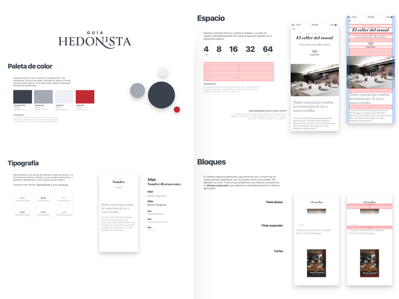
Design system: color, type, components, iconography.
The Style Guide serves as a vehicle to help people through different disciplines, to share knowledge and to collaborate with each other.
— Brad Frost
Prototypes used real restaurant data from the publication via Sketch + Craft + JSON. Designing with real content made density problems visible early and kept developer conversations grounded in actual data shapes rather than placeholder assumptions.
Final iOS app.
Impact
The app shipped on iOS and Android. The editorial voice of the publication carried into the product: photography leads, criticism is readable, categories are navigable. The filter fix measurably reduced the interaction ambiguity that had been appearing consistently in testing.
No post-launch engagement metrics are available for this case study.
Key learnings
Design principles are universal: truths contrasted a thousand times and tell us what works.
— Javier Cañada
Content strategy and product architecture are the same problem. A magazine and a mobile app have different content physics. Making the transition required rethinking what "reading" meant at different speeds, not just making the magazine smaller.
Ambiguity in interaction patterns compounds. The back/close confusion wasn't just an iconography problem — it was creating hesitation about using filters at all. One decision with misread affordances can suppress an entire feature.
Design with real data from the start. Prototyping with real restaurant content made problems visible that wouldn't have appeared with placeholders — long restaurant names, uneven photo quality, edge cases in category depth. The cost of fixing those issues in wireframes is close to zero; in final UI it isn't.