Koa Mindset. From 15% to 95% shared components — unifying a fragmented design system.

Koa Mindset

Overview of Koa Mindset after using Design System components
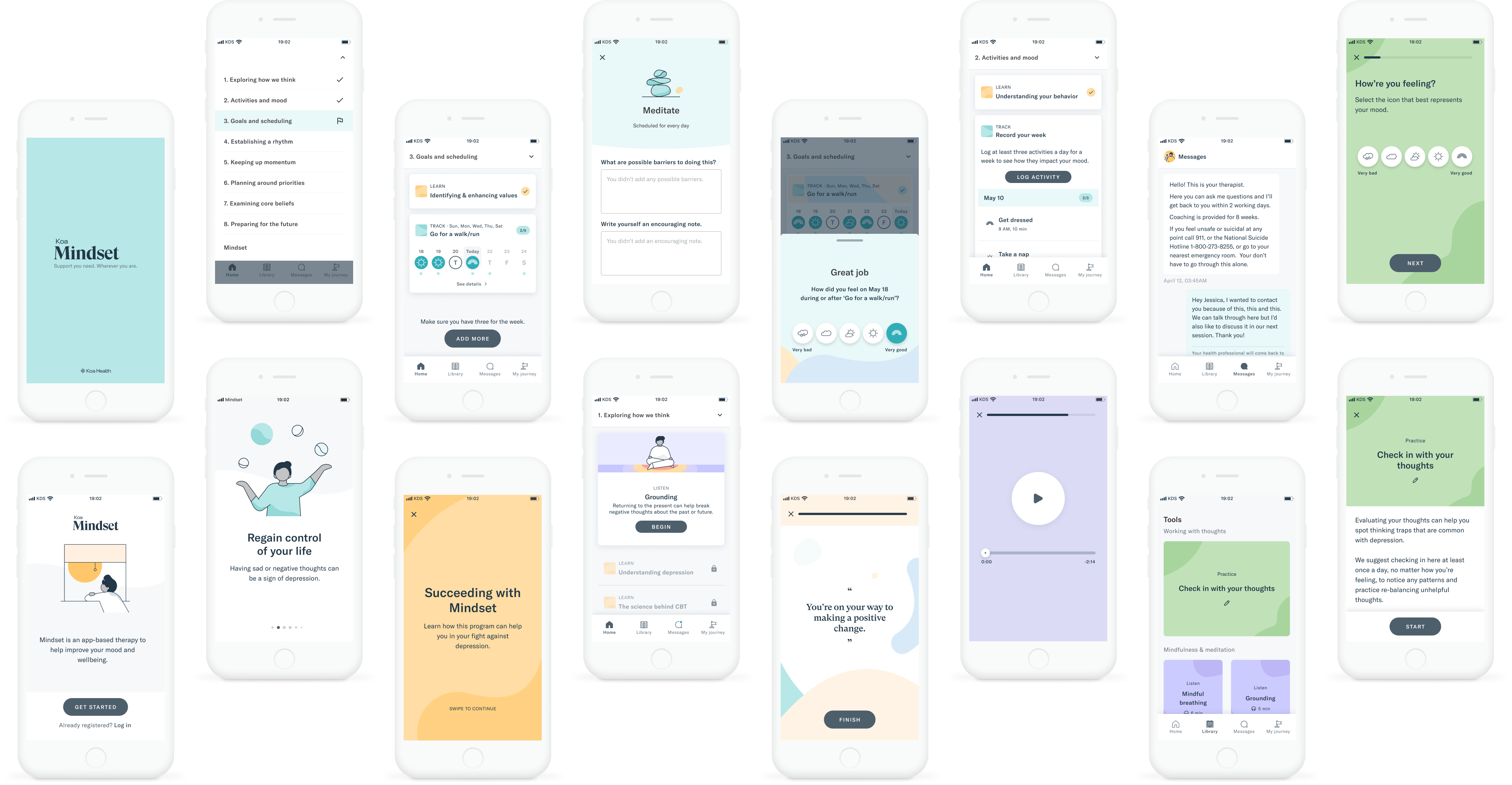
What Mindset is

Mindset is a CBT-based app for depression, developed in collaboration with Massachusetts General Hospital. It supports an 8-step therapeutic programme alongside brief therapist sessions — a "flipped classroom" model where the app handles psychoeducation between appointments, freeing therapists to focus on personalisation and risk monitoring.

The product lives in a regulated, high-stakes domain. Users are adults with a primary diagnosis of major depressive disorder. Design decisions carry real clinical weight.

The impact

As the core designer on Koa Mindset, I identified a cross-product design debt problem, made the case for a formal standardization initiative, and led the design execution — moving from ~15% to 95% shared components across two live products without a feature freeze.

The product was subsequently used in a peer-reviewed clinical trial by Massachusetts General Hospital and Harvard Medical School. Results across 28 participants over 8 weeks:

  • Depression severity dropped from moderate to mild — clinician-rated effect size d=1.47
  • 93% of participants would recommend the programme
  • App quality rated 4.3/5 across functionality, aesthetics, and information
  • 7% dropout — well below the norm for digital mental health tools
  • Gains maintained at 3-month follow-up

My Role

Senior Product Designer, Koa Mindset — working across two product squads alongside a fellow product designer, PM, engineering team, and a Design System lead.

  • Partnering with PM, engineers, design manager and other designers to set up the app vision, and participate in OKRs
  • Contributing to the design roadmap and task prioritization
  • Designing from conceptualization to launch, and evolving existent features
  • Contributing to and evolving the Koa Design System
  • Working closely with Massachusetts General Hospital to gather science-based insights
  • Creating documentation for implementation and QA before every release
  • Conceptualizing, partnering with researchers, and analysing usability tests

From all the features I led while at Koa Health, the one with the most strategic impact was the standardization of the app design — an initiative I identified and proposed before it became a formal project.

Standardization of the app design

The context, the Why

Two teams, two products, and too many custom solutions

When I joined Koa Health we had two main user-facing products: Koa Foundations and Koa Mindset. Each had been designed and built for different audiences by different teams — and the divergence was visible.

While the Koa Design System (KDS) was growing, both products were still running on a significant amount of custom solutions: bespoke components, divergent patterns, and product-specific workarounds that had accumulated over time. The consequences showed up across the stack:

  • Users encountered inconsistencies across products and features
  • Designers were reinventing patterns rather than building on shared decisions
  • Engineers were maintaining duplicated code across two codebases
  • The design system team had no clear path to adoption

The Challenge

How do we organize this so it does its job, costs less, and grows better — without stopping either team from shipping?

The Goal

Create coherent experiences across products, putting the Design System at the core of everything we build — making design and development more consistent, and faster.

As an active contributor to the Design System and core designer on Koa Mindset, I audited both products independently, documented the divergence, and brought the findings to a cross-product design meeting — making the case for a dedicated standardization initiative. That audit became the formal starting point for the project.

Koa Health tribe structure

Koa Health tribe structure and Design System team federated model

Getting to work

Auditing the products and defining what success looks like

I started by auditing both products systematically — laying the flows side by side, cataloguing every custom component and variant, and documenting where and how the products had diverged from each other and from KDS.

The audit surfaced the real scale of the problem. It wasn't a subjective case for "more consistency" — it was a concrete catalogue of what existed, what it was costing, and what a shared alternative would look like. This artefact was the most persuasive thing I brought to the cross-product meeting.

Mindset custom components audit

We documented all the custom solutions and worked towards a shared vision defined by our emerging language and shared components — with a testable endpoint: the majority of both products running on KDS components.

Creating the Components

Components as elements of a bigger organism

Instead of treating each product's needs separately, we reframed our components as elements of a shared organism sitting beneath both products. Every component was built with a default state that supported a set of tokens to serve different product needs — allowing each product to apply its own theming without requiring custom solutions.

Design System token structure

Together with the product designers and the Design System lead, I worked on identifying diverging patterns and designing unified alternatives — solutions that brought both products one step closer, without flattening their distinct contexts.

Accessibility was built into the system from the start: color tokens were defined to WCAG contrast ratios, focus states were standardized across components, and motion tokens accounted for reduced-motion preferences — defaults, not exceptions.

Koa Mindset before and after Design System update

Adoption Strategy

Bottom-up approach for implementation

Once we had a set of shared components and patterns, I partnered with the engineering team to design a roadmap for replacing existing custom components.

We considered doing a full clean rebuild — and rejected it. A parallel build would have required a multi-month feature freeze across both active products. For a live mental health product with active clinical partnerships, that wasn't viable. The bottom-up implementation strategy was the right call: replacing elements within views first, then view-groups, then root views — keeping both teams shipping while the migration happened underneath.

The sequencing wasn't just a technical decision. It required understanding which surfaces had the most user exposure, where inconsistencies were causing the most friction, and where KDS components were stable enough to replace custom solutions safely.

Results

A cohesive, clinically-validated product

We reviewed and unified the majority of the Koa Mindset app — from atoms to components to patterns — worked on proposals for covering gaps, and significantly reduced the custom solutions needed across both products.

This initiative allowed our products to accommodate theming without refactoring the full interface, and most importantly to maintain a cohesive feel, even while rapidly scaling.

+150

Deleted custom components and variants. A significant proportion of custom UI components and all their variants were removed from both products and no longer need to be maintained.

95%

Shared components. We moved from roughly 15% of shared components to 95% — increasing interaction pattern cohesiveness across both products.

d=1.47

Clinical effect size for depression severity reduction in the Harvard/MGH open trial using Mindset. Equivalent to or better than face-to-face psychotherapy benchmarks.

93%

Of clinical trial participants would recommend the Mindset programme. App quality rated 4.3/5 across functionality, aesthetics, and information — with only 7% dropout over 8 weeks.

Clinical validation

The product I helped design and standardize was used in a peer-reviewed open trial conducted by Massachusetts General Hospital and Harvard Medical School, published in JMIR Mental Health in April 2024.

The paper explicitly attributes outcomes in part to the user-centred, iterative design approach taken with the Koa team — noting the product was built to be "quickly scaled and professionally maintained." The app's aesthetics and information quality subscores (both 4.6/5) reflect the craft work that went into the standardized product.

Wilhelm, S. et al. (2024). Feasibility, Acceptability, and Preliminary Efficacy of a Smartphone App–Led Cognitive Behavioral Therapy for Depression Under Therapist Supervision: Open Trial. JMIR Mental Health, 11, e53998. doi:10.2196/53998

Lessons learned

  • Start the migration roadmap earlier. We defined the component architecture well, but the sequencing plan came later than it should have — a few surfaces were migrated in an order that created rework.
  • Make the audit visible sooner. The audit was the most persuasive artefact in the whole initiative. I used it primarily to make the internal case, but sharing it earlier with engineering leadership and product leads would have accelerated alignment.
  • Define "done" more precisely. 95% shared components was a meaningful metric, but the initiative didn't establish a clear process for what happens when a new custom solution gets created. Building lightweight governance into the DS workflow would have made the gains more durable.