Koa Mindset for Depression. A CBT-based mental health app validated in a Harvard clinical trial.

Mindset for Depression app

Mindset for Depression — 8-week CBT programme for adults with major depressive disorder
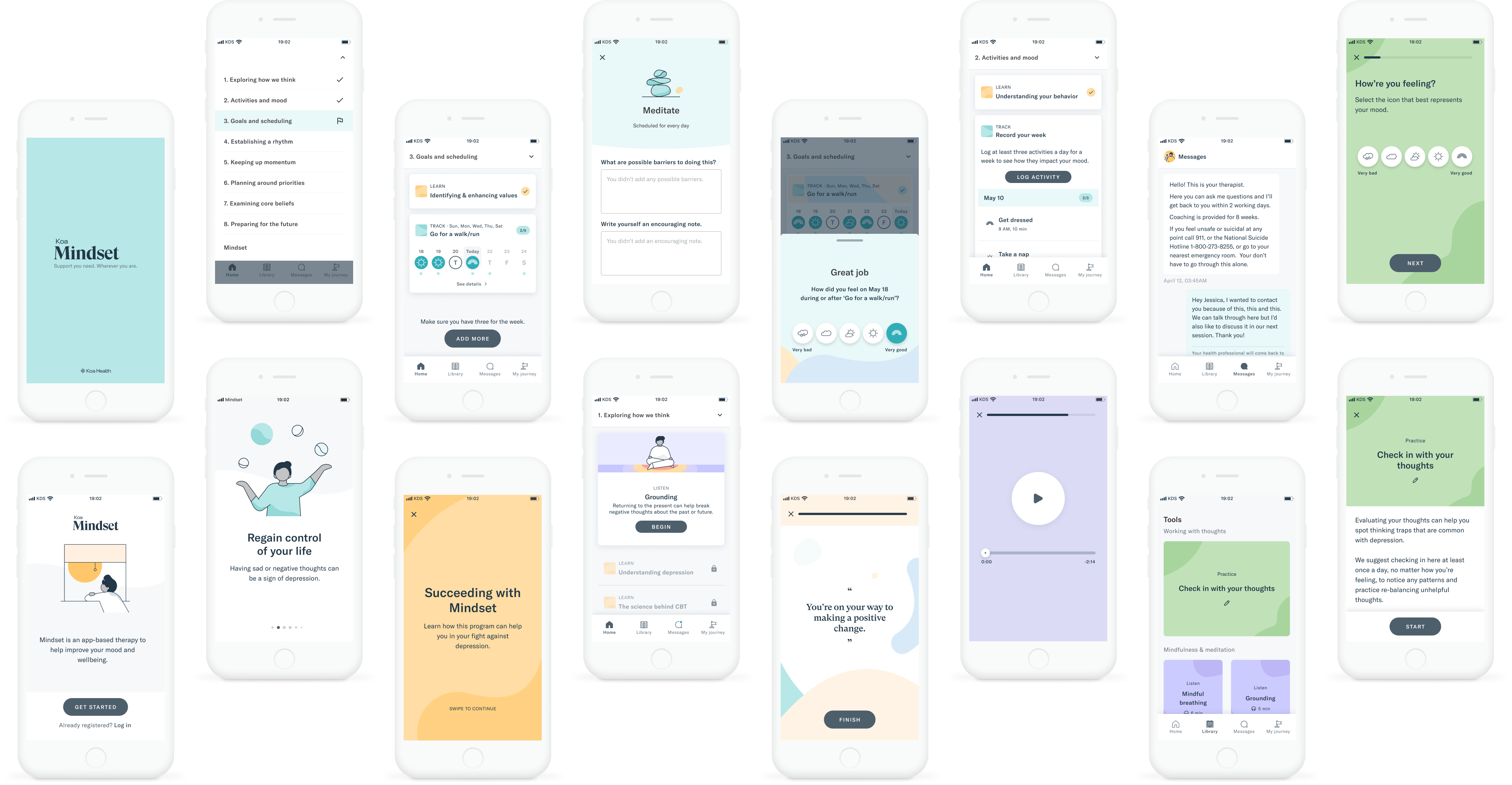
The problem we were solving

Depression is the leading cause of disability worldwide. An estimated 21 million adults in the United States live with major depressive disorder — yet only 23% in high-income countries receive minimally adequate treatment. The barriers are structural: not enough trained clinicians, geography, cost, and stigma.

Cognitive behavioral therapy is the most studied and recommended treatment for depression. But a full course requires 15–20 sessions of 45–50 minutes each — time and access most people don't have.

The design question was: could an app carry the therapeutic content, so clinicians could focus on the parts that actually required a human?

What we built

Mindset for Depression is an 8-week, smartphone-based CBT programme developed by Koa Health in collaboration with Massachusetts General Hospital and Harvard Medical School. Users work through the app at their own pace — reading, practising, and reflecting between sessions — while a licensed doctoral-level CBT therapist checks in weekly via a 20-minute video call.

The model is deliberately structured around a "flipped classroom" principle: the app handles psychoeducation and skills practice asynchronously, reserving clinician time for personalisation, problem-solving, and safety monitoring. This wasn't just a product framing — it was the core design constraint that shaped every interaction in the app.

My role

Senior Product Designer, Koa Health — one of two senior designers on Mindset, working alongside a design lead, design manager, PM, engineering team, an embedded researcher, and two clinical partners from MGH. I was on the product for 18 months, with patients involved in regular usability testing throughout.

The 8-step clinical structure was established before I joined — that was the researchers' domain. My ownership was in how each step was experienced: the interaction patterns, activity flows, logging interactions, tone, and the moment-to-moment decisions that determined whether the therapeutic content actually landed with someone going through depression.

I worked directly with the MGH clinical team to translate CBT methodology into interaction decisions — a process that required understanding not just what each technique does, but when and how to introduce it so it lands with a user who may not feel like engaging.

The design challenges

1. Making therapeutic content feel like something you do, not something you read

Users have moderate to severe depression. Low motivation, difficulty concentrating, and reduced sense of efficacy are symptoms, not attitudes. The clinical structure — 8 steps, one per week, progressively unlocking — was already defined. My job was designing what happened inside each step so the content actually landed.

The core shift was moving from information to practice. Instead of presenting CBT techniques as things to absorb, I designed them as things to do: short activities, interactive exercises, structured reflection prompts that moved users from reading to applying. One concept at a time, with harder material introduced only after foundational skills were in place.

The tone was a deliberate design decision I held consistently across the product. Professional and warm, not clinical and cold. Not cheerful or gamified. The product needed to hold the weight of what users were going through, and every word, label, and prompt was written with that in mind.

2. Revamping the logging interaction

One of the highest-frequency interactions in the product was activity logging — users recording what they'd done and how it affected their mood, a core part of the behavioural activation component. The original implementation used custom components built specifically for Mindset, which created visual inconsistency and added friction to an interaction users needed to complete repeatedly across weeks.

I revamped the logging card to use shared components from the Koa Design System — the same standardisation work happening in parallel across both products. The result was a cleaner, faster logging experience: less visual noise, quicker to complete, and consistent with the patterns users encountered elsewhere in the Koa ecosystem. For a therapeutic behaviour that only works if users actually do it repeatedly, reducing that friction mattered.

3. Safety check-ins that don't feel like surveillance

A mental health product for people with active depression must account for suicidal ideation and symptom escalation. This isn't an edge case — it's a design requirement. But the way you design for safety can easily undermine the engagement it depends on.

The guiding principle, agreed with the clinical team, was non-blocking: check-ins needed to be quick to complete, with optional notes rather than mandatory fields, and never positioned as gatekeepers to the next step. A user in a low moment shouldn't face a form that feels like an interrogation before they can access the content that might help them.

This meant designing the check-ins as lightweight logging moments — the same interaction language as the activity logging, not a separate clinical-feeling instrument. Fast to complete, honest to answer, easy to move past when notes weren't needed. The clinical team monitored responses; users just logged how they were doing.

What regular testing taught us

Patient testing was embedded throughout the 18 months — not a one-time discovery phase. Clinical partners, therapists, and patients with lived experience of depression all had input at different stages.

One finding that changed how I framed activities: during testing, participants were completing skills practice not just in the app but in their daily lives — applying techniques between sessions without being prompted. That told me the activities were functioning as genuine learning tools, not just compliance tasks. I shifted the language across the product away from "complete this exercise" toward "practise this skill" — a small change that reframed the relationship between user and content.

Another signal came from therapist feedback. Therapists reported that by the time patients arrived at their weekly session, foundational content was already covered — they could go straight to personalisation without re-explaining the CBT model. That validated the pacing decisions: the step architecture was doing its job.

Mindset for Depression app screenshots

Mindset for Depression — patient-facing app screens across the 8-week programme

Results

The product was tested in a peer-reviewed open trial conducted by Massachusetts General Hospital and Harvard Medical School, published in JMIR Mental Health in April 2024 (Wilhelm et al., doi:10.2196/53998). 28 adults with moderate-to-severe major depressive disorder completed the 8-week programme.

d=1.47

Clinician-rated reduction in depression severity (HAM-D) — a large effect size, comparable to face-to-face psychotherapy benchmarks.

4.6 / 5

App ratings for both aesthetics and information quality on the validated uMARS scale — above average for mental health apps in the category.

93%

Of participants would recommend the Mindset for Depression programme.

7%

Dropout rate over 8 weeks — well below the norm for digital mental health tools, where high dropout is the single most cited reason for ineffectiveness.

82.7%

Average homework completion rate across participants — indicating the activities were being completed, not skipped.

36.8 days

Average number of days participants actively used the app over the 8-week period, with a median of 7 out of 8 steps completed by the end of treatment.

What the numbers mean for the design

The clinical outcomes are the researchers' to claim. But the engagement numbers are design outcomes.

A 7% dropout rate in a digital mental health product is exceptional. Dropout in this category is almost always attributed to one cause: absence of human connection. This product was designed so that the app and the therapist reinforced each other — the app prepared users for sessions; sessions gave the app's content meaning. Neither felt redundant.

The 4.6/5 aesthetics rating matters because it signals that participants didn't experience the visual and interaction design as a barrier. For a population dealing with depression — where overwhelm and disengagement are symptoms — a product that rates this highly on aesthetics and information quality has earned something.

The 82.7% homework completion rate tells us that activities were designed at the right level of friction. Not so easy they felt pointless; not so demanding they were abandoned.

What the paper says about the design approach

The published paper explicitly attributes part of the product's success to the design methodology. It notes the product was:

"collaboratively developed with a design team, clinicians, and people with lived experience as well as rigorously applied user interface and experience best practices for mobile platforms"

And identifies specific design decisions as clinically meaningful:

"pacing content, shorter activity lengths, creating a professional and approachable tone, and inclusion of feedback loops"

These weren't incidental. They were deliberate design decisions made in collaboration with the clinical team, tested iteratively, and validated in a controlled trial.

Lessons learned

Clinical collaboration changes how you think about scope. When your stakeholders include licensed therapists and researchers who can tell you whether a design decision will harm a vulnerable user, "good enough" isn't a valid position. It raised my standard for what counts as finished.

Engagement is not the same as impact. The engagement subscale (3.6/5) was the lowest-rated dimension in the trial — the researchers called it out as an area for improvement, noting users wanted more personalisation and interactivity. High task completion and low dropout can coexist with "could be more engaging." That's a tension worth sitting with: a product can be effective without being delightful.


Wilhelm, S., Bernstein, E.E., Bentley, K.H., et al. (2024). Feasibility, Acceptability, and Preliminary Efficacy of a Smartphone App–Led Cognitive Behavioral Therapy for Depression Under Therapist Supervision: Open Trial. JMIR Mental Health, 11, e53998. doi:10.2196/53998