Movibeta. Oh, the film festivals you will discover.
The impact
Revamped Movibeta's platform by conducting foundational research and redesigning the user experience, resulting in increased user engagement, higher retention, and business growth.
The context
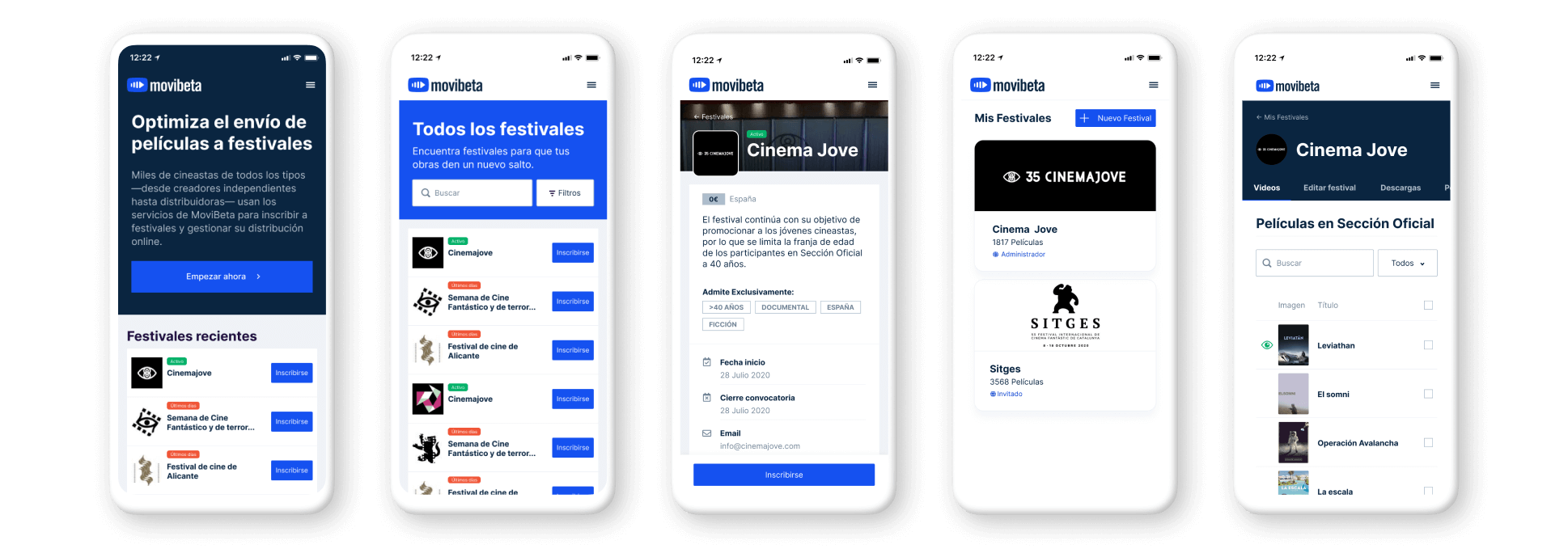
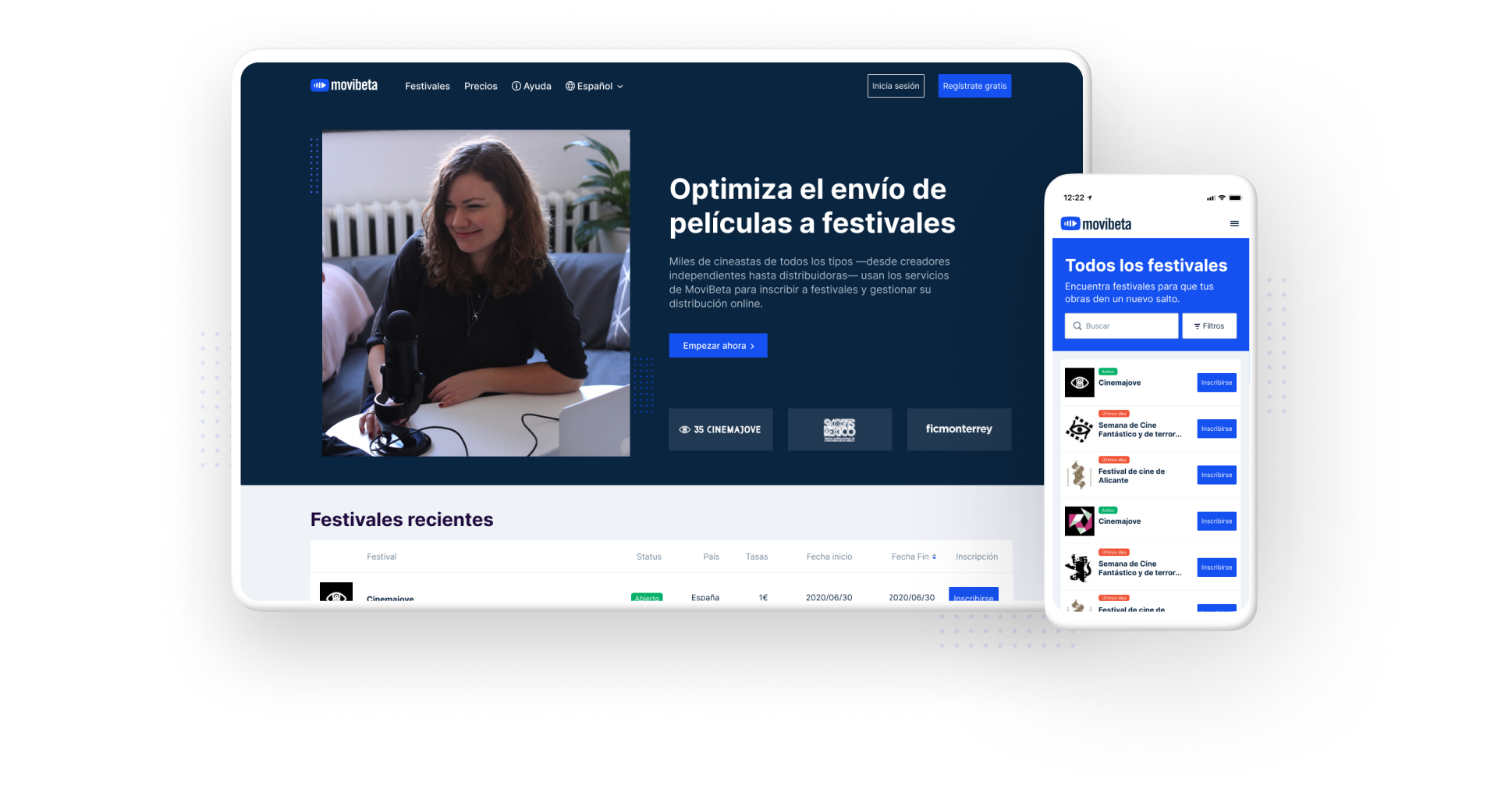
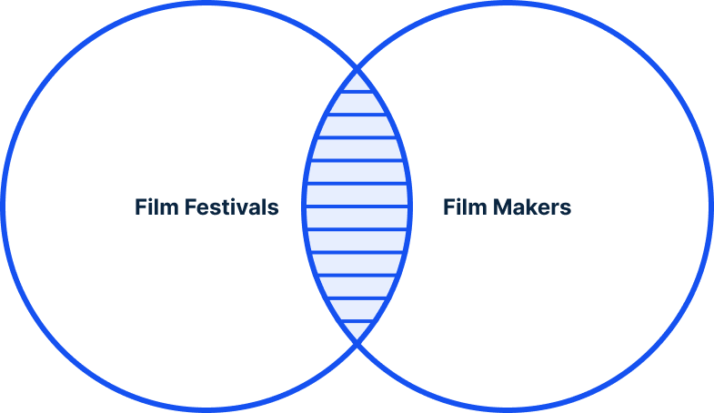
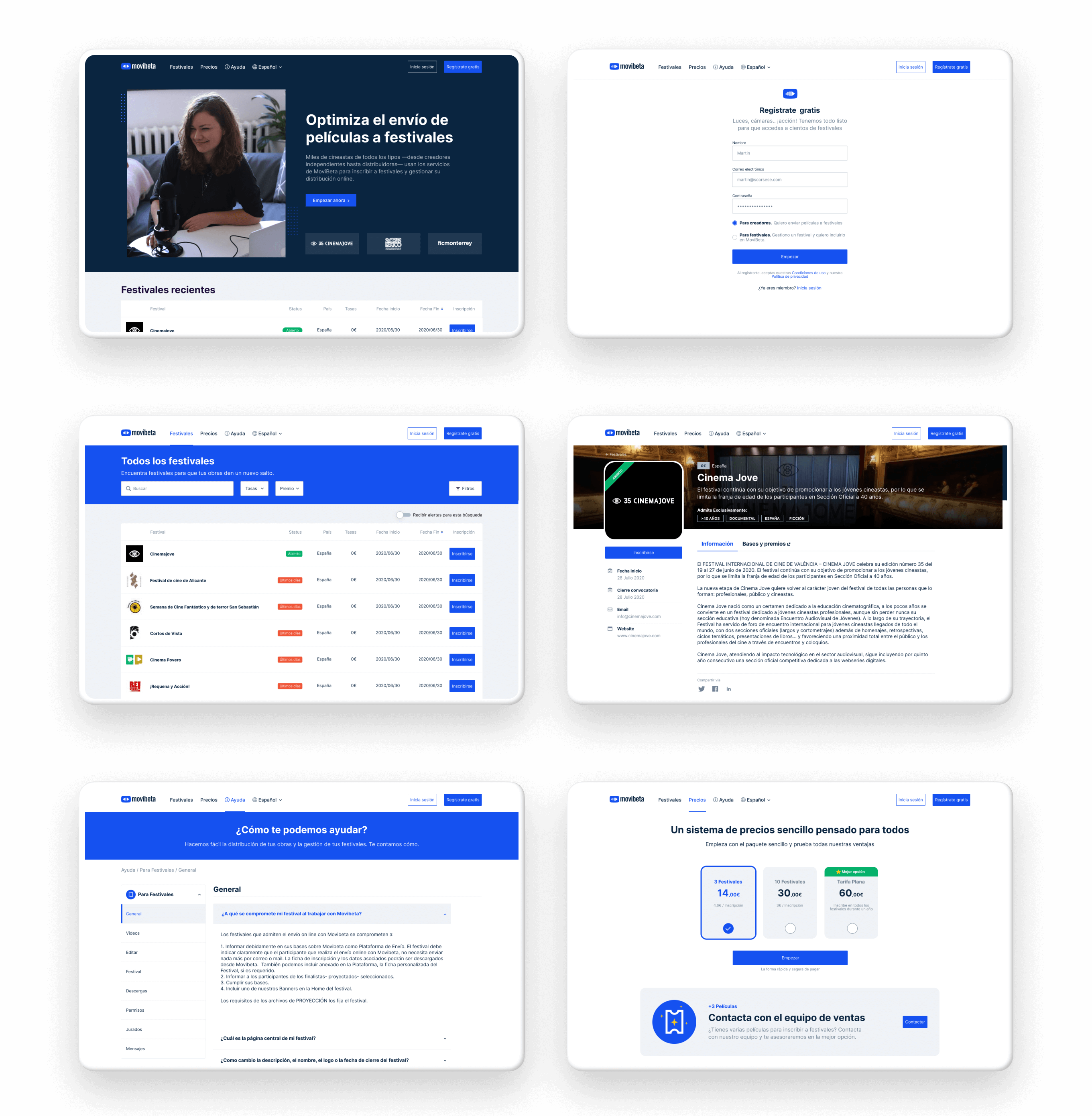
Helping filmmakers to connect with festivals.
Movibeta is one of the first SaaS platforms built to help filmmakers submit their films to the best film Festivals around the world. It also helps festivals manage all their film submissions.
In 2020 and specially after lockdown Movibeta experienced exponential growth with more than 2k new visits per week.
The Problem
The need of driving the business growth.
The current version was designed and developed about 10 years ago and it was not able to drive the growth of the business. The team wanted to refresh the platform with an improved UX to create a flexible platform for the next few years.
My role
Sole Product Designer, end-to-end.
As the only designer on the project, I owned the full scope — from research and strategy through to visual design, design system, and developer handoff — covering both the public site and back-office. We defined a framework for measuring UX success to help inform design decisions.
The process
A solid team process to get better solutions.
Foundational research
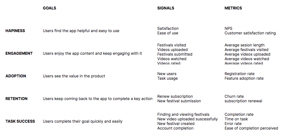
We defined a simple HEART framework for measuring UX success and for focusing on accomplishing prioritized goals.
My earliest research included collecting insights from quantitative data and interviewing key users to uncover their voice.
From problems to opportunities
From foundational research, I identified user groups and their experiences. This helped us frame user problems and opportunities.
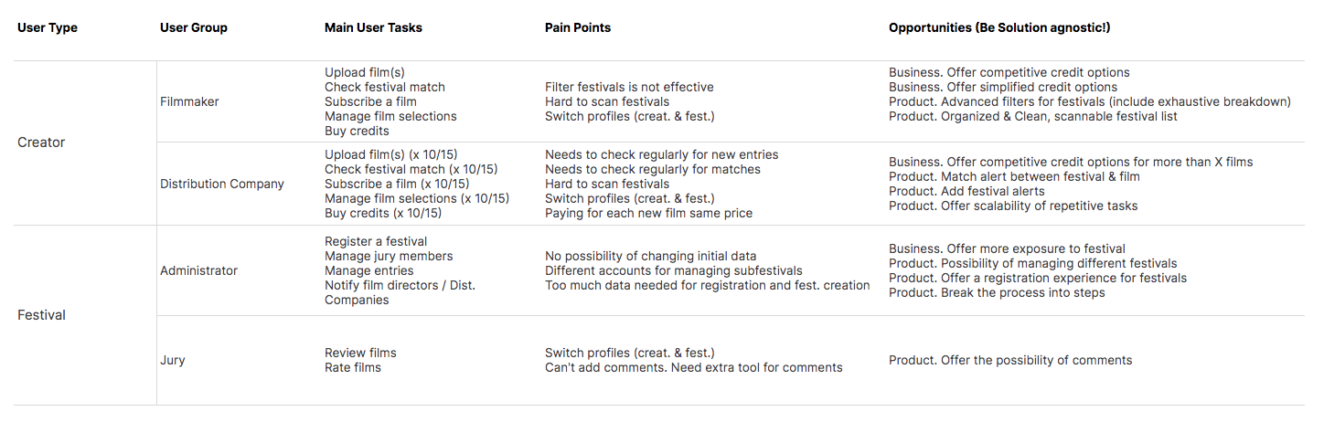
Initial affirmations:
- Homepage visitors have high intent to create or return to an account, but homepage lacked a clear value proposition.
- Complex user types like juries are experimenting performance issues.
- Pricing model is not as competitive for creators.
Driving Proposals
We run multiple brainstorming sessions to generate as many ideas as possible, then I started working on the low-fidelity prototype.
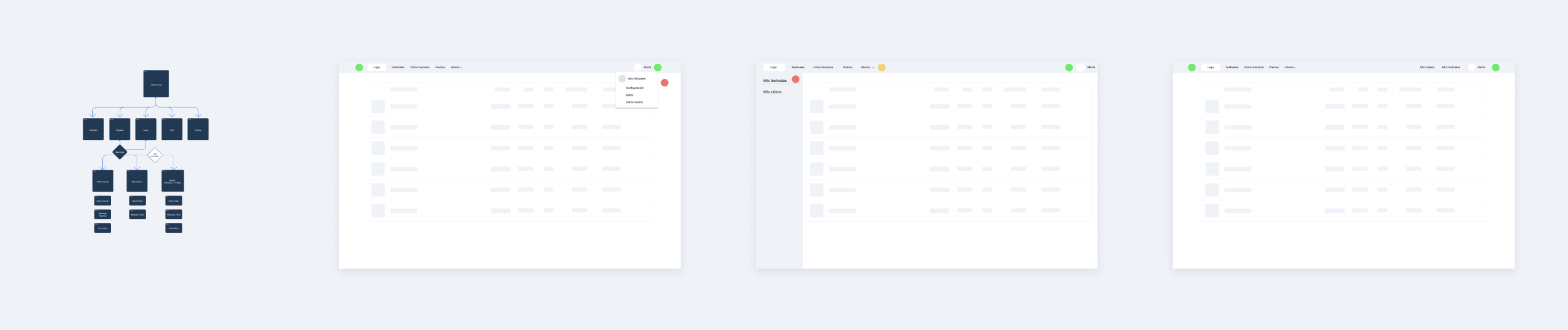
The key navigation decision was how to handle the two distinct modes users operate in: discovery and browsing (public site) vs. managing submissions and settings (back-office). We landed on a horizontal menu with a clear left/right split — public views on the left, user account options on the right — keeping both modes accessible without forcing a hard context switch between separate apps.
Creating, crafting and documenting
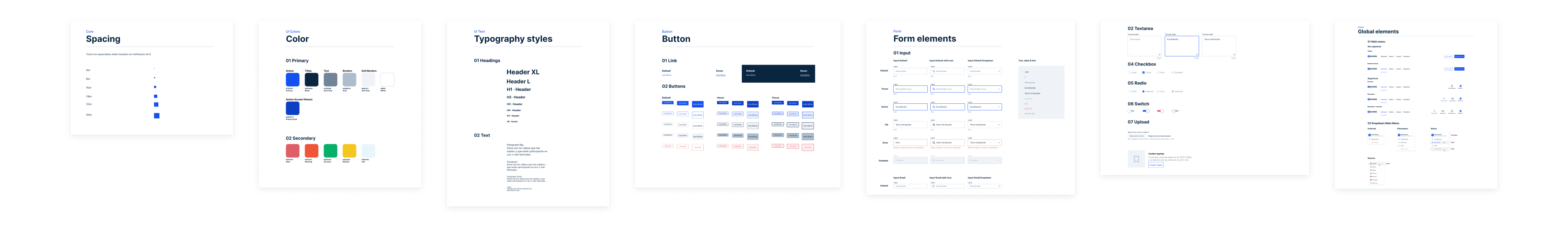
Started establishing how the new movibeta is going to look like — tokens, atoms, molecules, components and page layouts.
Documenting user flows and tasks was done to avoid information gaps when developing the new experience.
Impact
Designing to impact metrics.
Redesigning the public site meant not only modernizing an important part of our product but also delivering an inspirational narrative to those visiting with high intent. To better understand how the new platform performed, we made some qualitative research. The new user interface is perceived as slick and enjoyable to use by our own users. Visitors can find the value of the platform, so they are more likely to become users.
From the insights extracted by usability tests and surveys, we are providing a revamped version of the product that:
- Creates awareness while navigating through main flows and provides a clear, ordered and scalable navigation model
- Helps to perform core tasks effectivelly.
- Improves global brand perception
After the redesign, numbers are growing successfully while the new platform goes live. Against a backdrop of 2,000+ new weekly visitors, users spend more time within the site, visit more pages, and are much more likely to return within a week.
+14%
Time spent in the platform
-12%
Bounce rate
+10%
Pageviews
Learnings
In addition to our findings from experiments and research, I also learned a few things.
During this months of work I combined business requirements, tech constraints, quantitative and qualitative insights to create the best experience possible and help our users to perform better during their daily work.
- You need to have clear guidelines and alignment up front for what 'success means'. Product definition and deciding where to focus when designing can be difficult, but it's easy if you are aware of how success should look like and which achievements should we pursue looking at the big picture.
- Early insights from teams and foundational research help to make sure time and resources are well invested, focused and scoped before building.
- Building longer projects are at risk for scope. Making sure to clearly define requirements and hold yourself accountable to them.
Screens
Public site
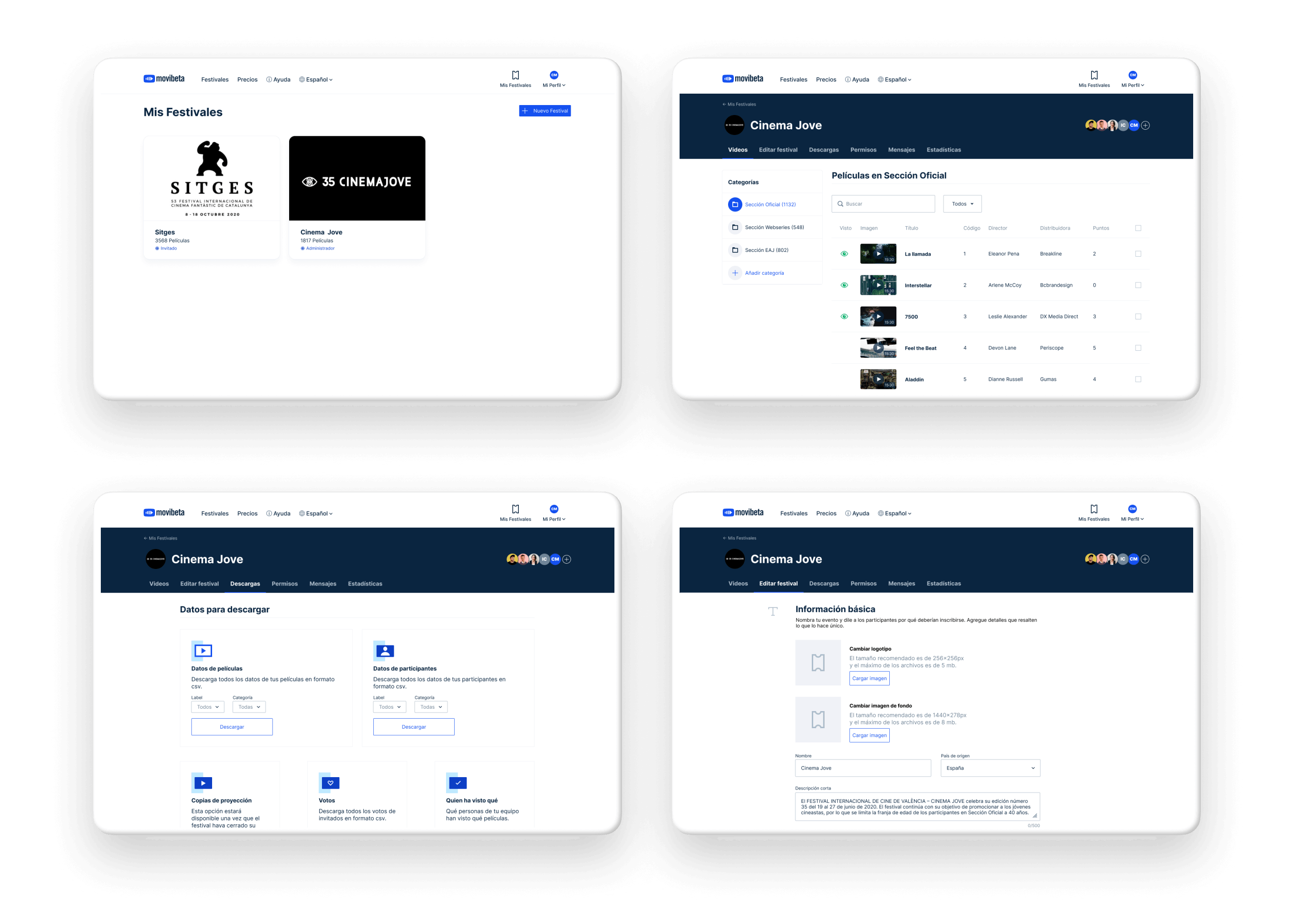
Backoffice for festivals
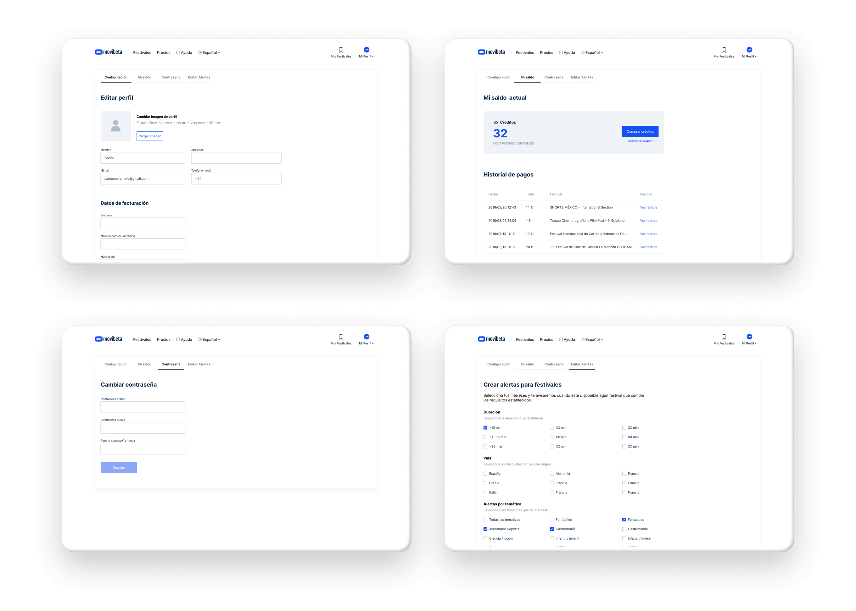
Global settings
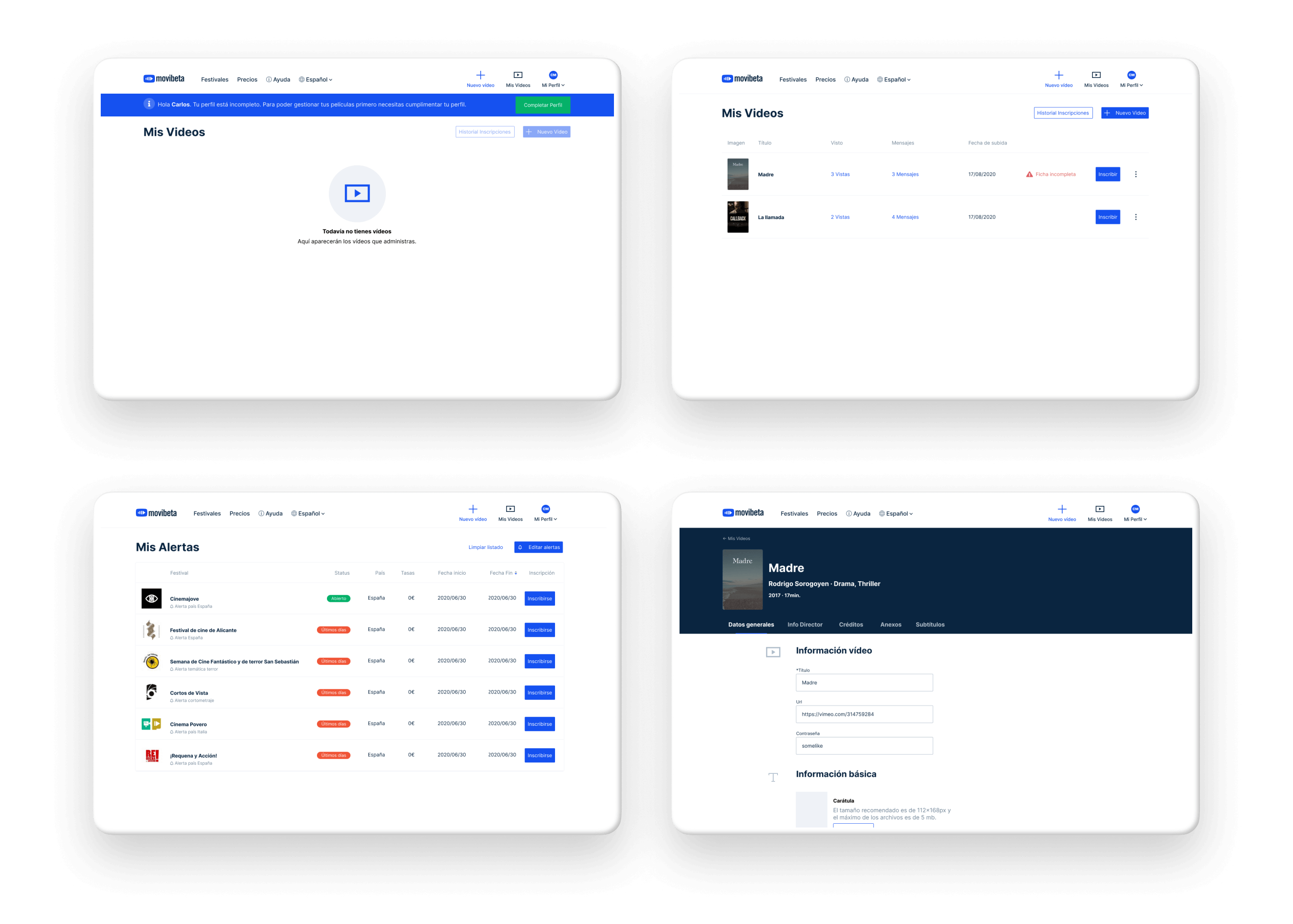
Backoffice for creators
Mobile screens